Finding the dominant colour in logo images: the why and the how
There are two parameters for the visual experience to balance when building a social platform: how much control over the overall design and how complex that control is. In this post, I’m going to show you how my team found this balance and implemented a simple solution.
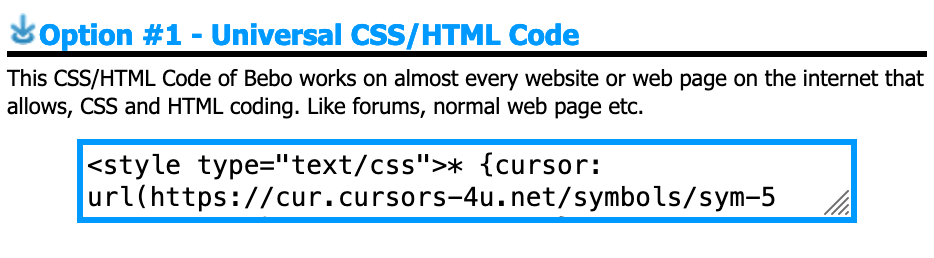
Those of you who are reading this and are around the millennial age may remember a social platform called Bebo. One thing Bebo allowed you to do was upload custom CSS for your profile page. Tumblr did this too (and still does!) as well as a handful of other early social platforms.
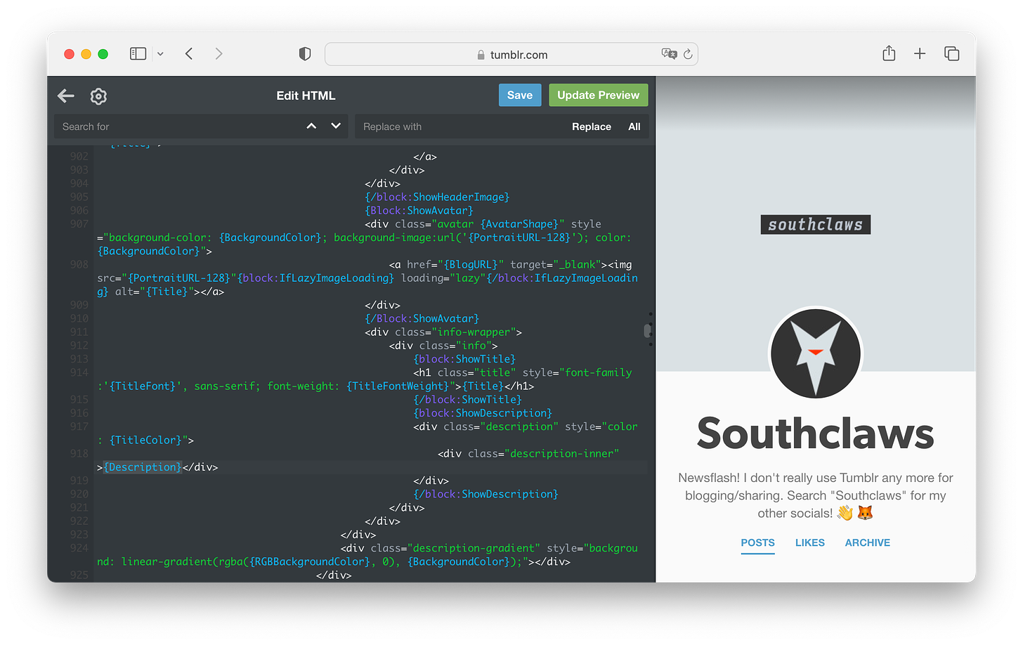
tumblr was one of the most unique social media platforms of the millennial era… and yes I am using past tense, it’s basically a zombie now.
This is very high visual design control, if you know what you’re doing you can essentially treat the platform as a website provider and turn their page structure into whatever layout and design you want.
On the other end, there’s Twitter, which doesn’t allow any visual customisation at all. You get to set your profile picture, header image and that’s pretty much it. You can change colours but only from a choice of 6 and it only affects your experience, not those viewing your profile.
Substack actually provides some simple but effective customisation options, you can pick any arbitrary colour as an “accent colour” like a lot of platforms nowadays, but you can even choose the typeface that your writing is rendered with. While this totally makes sense for a writing platform, I still think it’s really cool and it’s still not very common these days!
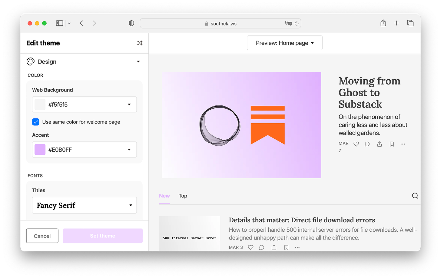
I picked mauve… obviously
Accent colours, highlight colours, brand colours, these are everywhere. The industry seems to have settled on this being your “customisation”. Gone are the days of custom CSS for your social page.
The ever-present buzzword: Simplicity
People use “simplicity” to justify almost anything in the product and engineering world, especially additional complexity.
To me, it’s become a bit of a cop-out answer to a lot of things in recent years. Almost to the point where the sentiment itself has reached semantic satiation.
With that said, there are definitely times in digital product interface design when simplicity is going to result in a tangible positive outcome. For example, simplifying the onboarding process for customers into your application or website is going to result in a lower dropoff rate.
A splash of colour
This is exactly where accent colours and the balance of customisation come in. While designing the onboarding flows for Odin, our designer wanted to get the absolute bare minimum information from the customer and do the most with it.
The end result of successful onboarding is some kind of profile (a person’s profile, a syndicate or a company, depending on what the customer wants to do) and that profile will have an accent colour.
Anything that’s not directly serving that goal to achieve this can be omitted from the flow and left for the customer to explore in settings later.

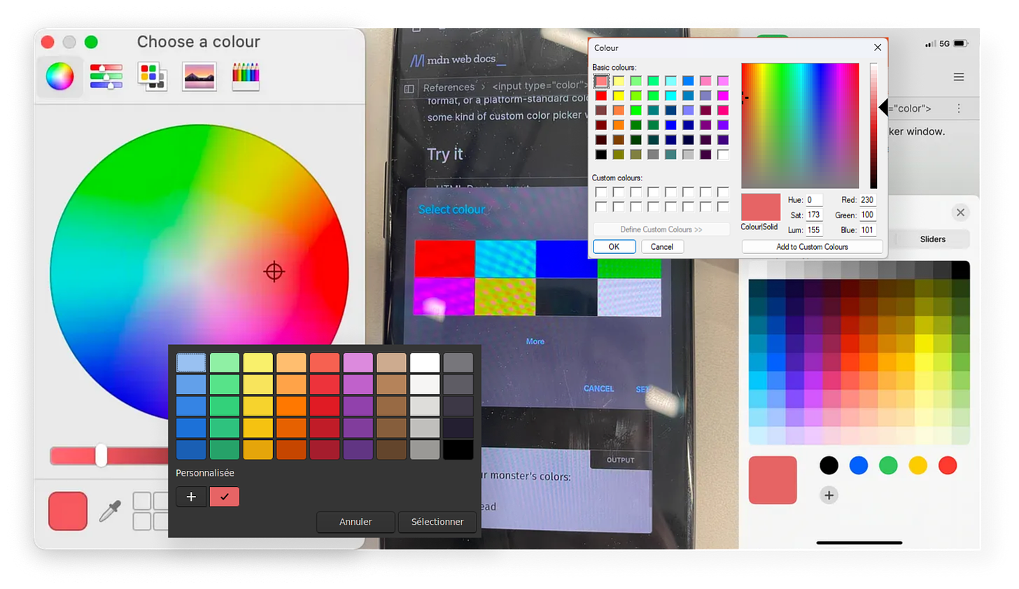
the assorted horsemen of the <input type=”color”>pocalypse
Now, I like using the correct semantic HTML and native components wherever possible as much as the next person. But colour pickers just ain’t it chief, I’m sorry! The experience is wildly inconsistent across platforms (yes, we care about more than Apple customers, crazy concept, I know.) and a lot of them are just generally not very user-friendly. (Apple’s is pretty mid but I have no idea what’s going on with the Android one above, it looks like My First Widget tutorial.)
We didn’t want to introduce another blocking requirement because our team is very small (if you want to change that, reach out to me!) so there’s an interesting alternative…
Finding the dominant colour in an image
If you read the why I hope you found it informative and it wasn’t too much of the same vibes as those recipe blogs that start every post with a 5-page life story… now on to the how!
We have three kinds of profiles on the Odin platform: people, syndicates and companies. I’m not going to focus on people here because the complexity involved in processing photographs is much higher than that of logo graphics and the tradeoff just isn’t worth it.
Logos generally have a small handful of colours, often just one in the primary brand material. So the first naïve approach is to simply bucket all pixels based on colour and then get the bucket with the most items.
I’m going to be writing the code for this article in Go, however, the underlying concepts apply to any language that can load and process images at a pixel level.
Go comes with a fantastic built-in image library, given some reader that’s going to provide a stream of bytes from an image, you can parse it in one line:
im, _, err := image.Decode(r)
As long as the image being read is one of the supported formats (JPEG, PNG, GIF as far as I can tell) you’ll get an image.Image object ready to use.
Now it’s just a simple task of iterating each pixel, grabbing the colour and using a hash table to record the number of hits each colour has:
rect := im.Bounds()
counts := make(map[color.RGBA]int)

for x := 0; x < rect.Max.X; x++ {
	for y := 0; y < rect.Max.Y; y++ {
		r, g, b, a := im.At(x, y).RGBA()

		c := color.RGBA{
			uint8(r),
			uint8(g),
			uint8(b),
			uint8(a),
		}

		counts[c]++
	}
}
This is fine but it’s very “sensitive”. Images aren’t just grids of pixels (unless they’re bitmaps, which are impractical to use due to their size) and many formats use lossy compression which results in all sorts of strange artefacts at the pixel level. Viewers rarely notice these artefacts as they’re subtle but they will affect this sort of per-pixel kind of operation quite a bit.
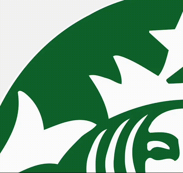
If we run this code on the Starbucks logo and count the number of pixel buckets (the hash table called counts) we get 786. If I asked you how many colours were in the Starbucks logo, you’d say either one or two depending on whether or not you count the white background as a colour.
This is a problem because these subtle differences in colour can result in the output being something you may not expect. What’s visually dominant to the human eye isn’t necessarily simply what the most popular pixel colour will be.
It sure looks like just one shade of green, and it should be, according to their brand guidelines (unsurprisingly named “Starbucks Green”.)
But if you run a colour picker over the image, not every pixel is equal. This is because the image is not a simple grid of pixels, but a collection of data points and algorithms that somewhat declaratively generate the grid of pixels at runtime. This is the reason there are so many buckets for an image with seemingly only two colours within.
The actual reason why this happens with formats like PNG is out of scope for this post, but Colin McAnlis has written a pretty nice post on the topic here.
Solving this is fairly simple though. The goal is to “snap” the pixel values to some nearby values so that colours that are only slightly different are considered equal in our hash table and thus contribute to the same bucket.
r, g, b, a := im.At(x, y).RGBA()
The values returned by the RGBA function are, according to the documentation, within the bounds 0 to 0xffff, or 65,535. So let’s write a function that “snaps” the value to the nearest hundred:
func normalise(i uint32) int {
	return int(math.Round(float64(i)/100) * 100)
}
The math is simple: divide by a hundred, round the result then multiply that result by a hundred. This effectively reduces the precision of the number.
fmt.Println(32456, "->", normalise(32456))
// 32456 -> 32500
This gets us one step closer, “nearby” values are now being considered the same value due to this simple rounding.
There’s a more efficient way to do this using bitwise manipulation but our goal isn’t speed here so I’ll leave that as an exercise for the reader.
One last thing left to do is map our value space from [0, 65535] to [0, 255]. The reason for this is that we want to end up with a color.RGBA value and the red, green, blue and alpha struct fields are of the type uint8, which is far smaller than the values returned by the RGBA function above. This is just a simple case of dividing the values by 256.
And since we’re working in the space of 0-255 now, snapping to the nearest hundred makes a lot less sense. We can instead snap to the nearest multiple of 8. Some experimentation can help you find the balance here.
func normalise(i uint32, f uint32) uint8 {
	return uint8(math.Round((float64(i)/256)/float64(f)) * float64(f))
}
And putting it all together:
rect := im.Bounds()
counts := make(map[color.RGBA]int)

for x := 0; x < rect.Max.X; x++ {
	for y := 0; y < rect.Max.Y; y++ {
		r, g, b, _ := im.At(x, y).RGBA()

		c := color.RGBA{
			normalise(r, 8),
			normalise(g, 8),
			normalise(b, 8),
			0,
		}

		counts[c]++
	}
}
One notable change here is the alpha channel is being completely ignored. We’re not interested in considering transparency when bucketing colours.
Now when the code is run on the Starbucks logo, there are only 123 buckets! We can also filter out anything with a lightness level that’s too close to white or black:
// RGB to HSL is well-trodden ground, you can find it on the internet.
hsl := tohsl(
    float64(r>>8)/255,
    float64(g>>8)/255,
    float64(b>>8)/255,
)

if hsl.l < 0.2 || hsl.l > 0.9 {
	continue
}
This gets the bucket count down to 88. Which seems like a manageable level to continue from and implement the rest of the code.
type bucket struct {
	c color.RGBA
	n int
}

type buckets []bucket

func (a buckets) Len() int           { return len(a) }
func (a buckets) Swap(i, j int)      { a[i], a[j] = a[j], a[i] }
func (a buckets) Less(i, j int) bool { return a[i].n > a[j].n }
We want to sort the list of normalised colours by the number of times each colour appears in the image (remember, these are normalised colours).
Now, Go doesn’t really have a lot of tools for easily manipulating hash tables and slices in the same way languages like Java, C#, JavaScript, etc. have, so I am going to grab a third party library called “lo” to make this a little more expressive and a little less explicit.
// turn our hash table into a slice of tuples
// before: { "#34fe56": 45, ... }
// after: [ ["#34fe56", 45], ... ]
entries := lo.Entries(counts)

// map each entry to a "bucket" as defined earlier
b := lo.Map(entries, func(e lo.Entry[color.RGBA, int], _ int) bucket {
	return bucket{e.Key, e.Value}
})

// sort the buckets using the logic defined in the "buckets" slice type
sort.Sort(buckets(b))
After this bit of processing, we now have a slice of “bucket” values which contain the “rounded” colour and the number of times this, and similar, colours appear in the image.
Since it’s sorted descending, the first item in the slice is the most dominant colour!
return b[0].c, nil
Which, after running on our Starbucks logo, the result is:
#107030
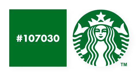
Which is definitely close enough!
Hopefully, now you can see why this simple approach only really works for graphics. Photos are much more complex in terms of data density and while this naïve pixel rounding approach would pick the mathematically dominant colour, that’s not necessarily going to be the colour someone would expect.
If you enjoy discussing problems like this, perhaps you’d be interested in joining our 100+ strong Discord server of like-minded folks!