Migrating from Chakra UI to Panda CSS
In this article I'll be covering the motivations behind why I'm adopting Panda CSS for my frontend work, how it compares to Chakra UI, and how you can migrate from Chakra UI to Panda CSS gradually as well as what kind of work is required to maintain both in the same codebase for a period of time.

What actually is Panda CSS?
You know what Panda is, because you searched for it and found this article. But just to ~~give you a refresher~~ do some SEO magic for Google.
Panda CSS is a new utility-first CSS framework. Now you might be thinking "oh so just like tailwind/tachyons" and the outcome does look similar but there's a key difference. Panda's main power is that it's built on the idea of code generation rather than pre-defined utility classes. So instead of writing tweet sized className strings you can make use of generated classes or JSX style props much like styled-components.
But it retains the unrivaled (in my opinion) developer experience of style props, for example:
<styled.article
  className="content"
  display="flex"
  flexDir="column"
  gap="8"
  w="full"
  overflow="hidden"
>
becomes these utility classes:
.d_flex {
  display: flex;
}
.flex_column {
  flex-direction: column;
}
.gap_8 {
  gap: var(--spacing-8);
}
.w_full {
  width: var(--sizes-full);
}
.overflow_hidden {
  overflow: hidden;
}
And it's all based on modern web native technologies like CSS layers, variables and conditionals.
One thing worth noting is that Panda CSS is just the styles part. It's not a component library and does not provide out of the box components to use like Chakra does. Panda is sort of like a replacement for Emotion, which Chakra uses. If you want to know more about this growing ecosystem, I highly recommend reading this by Segun Adebayo, the creator of Chakra UI:
Chakra, Panda and Ark - What's the plan?
With the recent release of Panda and Ark UI, what's the plan for Chakra UI?
Motivations to move
Now, Chakra UI is fairly similar so why might you want to change? If you've come across this article from a Google search, perhaps you've already made the decision and understand the why and are only interested in the what and how. If that's the case, feel free to skip forward.
It boils down to three reasons:
- Outgrown somewhat, I'm hitting roadblocks more often
- Feels bloated, lots of client side JS with Emotion
- Need a static solution for Storyden's on-prem use-case
I work on a few frontend projects ranging from small, mostly static, landing pages/marketing sites, both personal and commercial as well as large complex web applications, one of which is Storyden the other is Odin where I'm a full stack engineer and we're currently going through this migration.
Among all of my work, I value simple pipelines and isolated complexity. Complexity is always present and managing it is the difference between a dead "side project" and a successful product.
Chakra served me very well and it will continue to do so for some projects but with products like Odin and Storyden that I'm going to customise all the components anyway and I want small static CSS and minimal runtime impact, Panda just makes more sense.
If you want to read the first Storyden PR that started the migration, that's here: https://github.com/Southclaws/storyden/pull/30
What's the deal with RSC, SSR and "use client"?
This is the one that got me started exploring alternatives to Chakra. The main thing Next.js 13 introduced was the usage of a fairly new React feature called "React server components" Josh Comeau wrote a great piece on the details of what that actually means and I encourage you to read it if you're interested:

Making Sense of React Server Components
This year, the React team unveiled something they've been quietly researching for years: an official way to run React components exclusively on the server. This is a significant paradigm shift, and it's caused a whole lot of confusion in the React community. In this tutorial, we'll explore this new world, and build an intuition for how it works, and how we can take advantage of it.
What confused me at first was RSC, SSR and "use client", which this article covers very well! The short version is: Chakra UI still supports server side rendering, but not server components. Which means I can't make use of certain component tree optimisations and features mentioned in the above article.
The reason for this is that Chakra UI uses Emotion for styling, which is a CSS-in-JS library. It's great, I've used it for years, but it's not compatible with RSC for various reasons.
So I decided to switch in order to both make use of the latest Next.js features as well as learn how they work in a real production application.
export async function Server() {
  const data = await fetch("/v1/threads");

  return (
    <Box>
      <Client threads={data.threads} />
    </Box>
  );
}
In this minimal example, the Box we see is not Chakra's, but Panda's. And the component is a React Server Component, which allows top-level awaited fetch.
Static is generally simpler
The other reason is that Chakra has been getting in the way a bit more recently, both at my full-time job and in my own products. I've been using it for a few years now and I've always been a fan of the developer experience. But the generated styles are named using hashes, the bundles are quite big and I've run across a few weird bugs over the years that are often down to Emotion itself or style state getting out of sync.
Panda, being mostly built on the ideas of CSS variables, design tokens and code generation felt much simpler. And now that I've migrated or been involved in the migration of about 4 and a half codebases, I can safely say it is.
Migrating
Alright let's get to the good bit. How do you migrate from Chakra UI to Panda CSS?
It's fairly smooth but it will depend quite a bit on your approach to web development. If you're a strong advocate for semantic HTML and separation of concerns when it comes to semantics, styles and behaviours then you won't run into much trouble. But we all have technical debt so I'll cover some common cases I've seen and the solutions I've had success with.
Note that this will focus on Next.js as that's my primary framework and the most popular. The same principles may apply to other frameworks but honestly, I've no idea.
Install Panda CSS
Follow the installation instructions from the Panda documentation, no additional steps are required but I can recommend a few:
- set
jsxFramework: "react"in your Panda configuration: this enables style props, so you can continue to use<Box w="full">and friends. - add
"paths": {"@/styled-system/*": ["styled-system/*"]}to your tsconfig for import mapping. - add
styled-systemtoincludein tsconfig so all the types do their thing.
Relevant documentation: https://panda-css.com/docs/concepts/style-props
Switch out the CSS reset
Next, you'll want to switch out the CSS reset for Panda's. This is purely because there's no point having two resets, and Panda's will be your main one going forward anyway so it's best to get this out of the way (and identify any weirdness) as early on as possible.
First enable Panda's reset, it's called "preflight" for some reason 🤷
export default defineConfig({
  preflight: true,
  ...
Then disable Chakra's reset in the top-level context provider in the root layout.
export function Providers({ children }: PropsWithChildren) {
  return (
    <CacheProvider>
      <ChakraProvider resetCSS={false}>
      ...
And you're done! Refresh your app and you should see no differences. If you do, I'd love to know so I can add them here for future readers @southclaws!
Start with layout primitives
Now you can start migrating your components. I recommend starting with the layout primitives, things like Box, Flex, Grid and Stack. These are the easiest to migrate because they're mostly just layout and spacing. Chakra's default theme uses numeric tokens such as "2", "4" but also named tokens like "md" for medium and "lg" for large.
The scale of the numeric tokens is the same:
However, named tokens are slightly different. Chakra has:
--chakra-sizes-container-sm: 640px;
--chakra-sizes-container-md: 768px;
--chakra-sizes-container-lg: 1024px;
--chakra-sizes-container-xl: 1280px;
Whereas Panda has:
--breakpoints-sm: 640px;
--breakpoints-md: 768px;
--breakpoints-lg: 1024px;
--breakpoints-xl: 1280px;
--breakpoints-2xl: 1536px;
And there are a few other places where tokens in the default theme differ. But this is where strict tokens really helps. You'll get TS compiler warnings everywhere when these tokens don't match.
As for when the values differ, you'll just have to add some custom tokens to your Panda config. I recommend using the same names as Chakra's tokens so that you can migrate gradually with minimal disruption.
How do conditionals work?
This is something that caught myself some of my coworkers off guard. Chakra is fairly SPA focused so it encourages you to use JavaScript quite a lot to handle conditions. This can range from simple things like using ternary operators for styles to using useBreakpoint to determine a component's size.
Panda takes a different approach and encourages you to use the native tools of the web platform. This mostly boils down to:
- CSS conditionals and variables
- Media queries
- Data attributes
One place where this caught me off guard was a floating sidebar component that used the same width as the navigation layout's void area that it floated above. In one file I declared this:
export const SIDEBAR_WIDTH = {
  md: "25%",
  lg: "33%",
};
And in the two components, I simply imported this conditional and used it.
But this does not work with Panda, because it cannot statically analyse the runtime value of SIDEBAR_WIDTH and therefore cannot generate the correct CSS. So, I could (and initially did) just copy-paste the width and leave a comment, but the correct way to do it would be to define a width in the config with a conditional.
First, define a semantic token called sidebarWidth
sizes: {
  sidebarWidth: {
    value: {
      md: "25%",
      lg: "33%",
    },
  },
},
Then, in the component, you simply use sidebarWidth for the width.
<styled.header width="sidebarWidth">
And that's it! If we inspect the generated CSS, we can see it's using a media query and a CSS variable to set the width.
@media screen and (min-width: 48em) {
  :where(:root, :host) {
    --sizes-sidebar-width: 25%;
  }
}

@media screen and (min-width: 64em) {
  :where(:root, :host) {
    --sizes-sidebar-width: 33%;
  }
}
Avoiding or isolating dynamism
This is mostly just general web application advice though it mostly applies to the kinds of applications that I work with: public facing, first-render-performance-sensitive web applications that also act as web sites. Storyden is a perfect example as it's an application with lots of interactive parts, but it's also a website that provides public pages that are indexed by crawlers and used by a variety of users and devices.
You may have Chakra code that looks like this:
<Box backgroundColor={isSomething ? "blue" : "red"}>
React makes this quite easy to do, and it's not inherently bad, but it's a technique that should be used with intent. We've discussed how conditionals work for media queries already, but this section concerns interactivity.
Generally speaking, Panda on its own is not the solution for switching styles based on state. Whereas Chakra will quite happily work well with this as it's based on Emotion which does all the CSS changes dynamically.
In the example above, "Something" is an interactive state, triggered by a user action. We're out of pure HTML+CSS world now and into the realm of JavaScript. But if you can't switch out the styles based on state, how do you do it?
Data attributes
The answer is data attributes. This is a web-native way of adding state to your components which is reflected when those components become elements. Using this encourages you to declare these states in your Panda config, which will generate all the necessary conditional CSS allowing the browser to deal with the state management so you can focus on the user experience.
Panda has a section of its theme config called "conditions" which is where you set up shorthand names for CSS conditional selectors which you can then use in your components.
Given our example, let's turn this into a Panda-friendly component 🐼
First, we need to define a condition in the config:
conditions: {
  something: "&:is([data-something])",
}
Next, you create a semantic token that uses this condition:
colors: {
  somethingConditional: {
    value: {
      base: "red",
      _something: "blue",
    },
  },
  ...
Note: conditions only work in semantic tokens! This is because conditionality is fundamentally a semantic thing relevant to the usage context. The regular tokens are more low level and should be used for defining simple key-value data for colours and other things from your design system.
Now you can use it in the component, we even get auto-complete!
<Box data-something={false} backgroundColor="somethingConditional">
  Hello there conditionals!
</Box>
And when you want to change the state, you don't need to worry about styling in the context of the component code, you just need to change the data attribute from false to true.

<Box data-something={true} backgroundColor="somethingConditional">
  Hello there conditionals!
</Box>

Use the vars(--luke)
Sometimes you really do need something local to a component and you don't really want to pollute the global Panda styles with lots of code that's only going to be used in one spot. For example, Storyden has this neat little colour picker that's only used on the admin dashboard for setting the theme. Now I could create a recipe for this but it's only used in one spot and it's not really a "theme" thing, it's a "component" thing.
So for these cases I've been using the style attribute! And I know, it's generally discouraged for good reason but I follow the rule of only using style to set variables which are cascaded to children. Then in the children I can use those variables to set styles.
Be careful with components that accept children though, there are lots of good resources online about best practices when it comes to this.
The core difference here is you can't just do something like:
<Box fontSize={someVariable}>Hello there dynamism!</Box>
As you'll get a type error thanks to Panda's strict tokens:
Type 'string' is not assignable to type 'ConditionalValue<FontSizeToken> | undefined'.
Instead, break out the style attribute:
<Box style={{ fontSize: someVariable }}>Hello there dynamism!</Box>
There may be a better way to do this, and I'd love to hear your input!
Light and Dark mode
Light and dark mode is fairly similar to Chakra however the actual implementation is fully native and makes use of prefers-color-scheme instead of using localStorage to keep this state, like Chakra does.
In fact, this blog you're reading right now makes use of this! Head over to the source code and check out the Panda configuration file.
In short: _osDark is a ready to use conditional you can drop in to any semantic token like this:
colors: {
  background: {
    value: {
      base: "{colors.offblack}",
      _osDark: "{colors.offwhite}",
    },
    ...
Regular tokens and semantic tokens
One of the mindset shifts I had while learning Panda was the difference between regular tokens and semantic tokens.
The way I think about this is that regular tokens are low level and are tied to your design system. For example, colours will be the cute colour names your amazing designer thought up like "fauve", "gunsmoke" and (my personal favourite) "minecraft".
Semantic tokens are more about the actual use-cases those colours are being used in and will likely be a lot more generic and widely recognised like "success", "info" and "destructive".
Sometimes the differences can blur, like on this blog I originally defined "heading1" as a regular token but then realised it's kind of semantic so I moved them to semantic tokens. I think in a larger project with a full typography scale, there may be a large set of sizing tokens defined as regular tokens and then things like "heading", "body", etc would be semantic tokens.
Chakra UI vs Panda CSS
Chakra is great. It really is. Segun and contributors have done an amazing job with the library. It's my go-to for quick things but it also scales really well to full-blown applications. Style props are my preferred way to do any form of styling nowadays and Chakra's built-in theme, tokens and components are pretty much all you need to build a great product.
Compile-time goodness
Panda generates all the CSS at compile-time, which I love the idea of. I make use of declarative spec-driven code-generation a lot for my work and applying this to the frontend felt natural.
Strict tokens
It also has "strict" mode which essentially means that you cannot use ad-hoc styles, you must use tokens. This is great for enforcing consistency, raising inconsistencies to the designer and making sure everything satisfies your design system.
Conditionals are web-native
Did you ever border={isClicked ? "brand.blue" : "grey.200"} I did. It's nice, but realistically speaking what you're looking at here is a JavaScript branch expression. And I promise this isn't tin-foil-hat-javascript-fear but it's using procedural constructs to encode a semantic that already exists in CSS.
I'd rather use the tool for the job, a [data-clicked="true"] selector. Panda is great at setting these up and it's as simple as `_clicked="brand.blue". Which generates purely static CSS. All you need to do is add the data attribute to your component when the time is right. The styling state change is then entirely handled by the browser, declaratively, via the stylesheet.
This means less state for you to worry about, less expressions being evaluated and ultimately, less code to maintain.
Things to watch out for
Type safety is only for components
As of writing, currently the types for tokens do not extend to the actual panda.config.ts file so you can easily make typos with tokens and get confused as to why things break.
When the code actually gets generated, it doesn't seem to check if the token exists and will quite happily just generate CSS with invalid syntax.
For example, if you set a semantic colour to a nonexistent token:
colors: {
  oops: {
    value: "{colors.reddd}",
  },
  ...
And use it in a component:
<styled.p color="oops">
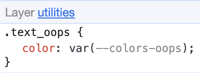
The CSS applied to this component is invalid:
.text_oops {
  color: var(--colors-oops);
}
And you can see the variable name is greyed out in the inspector:
With no warning from Panda at compile-time during development, you'll only find out about this when inspecting the actual live site.
This is annoying but it's only isolated to the Panda config currently, and I believe the Panda team are working on a solution for this!
Cloudflare can confuse you
This isn't specifically related to Panda, but I ran into this issue and it's not widely documented so I felt it makes sense to mention.
When I ran into the above issue with invalid token names, I accidentally shipped a version of Storyden that had this CSS:
.md\:min-w_md {
  min-width: container.md;
}
container.md is from Chakra, I accidentally copied the token into a Panda component. min-width: container.md is not valid CSS syntax and because I had Cloudflare's CSS minification enabled for production, it failed to minify.
But it didn't just fail to minify, it just considered the entire rest of the file as a single token and stripped all spaces from the rest of the code. This resulted in shipping a CSS file that was half valid and the rest was a single blob of text that included beauties such as @mediascreenand(min-width:64em){.
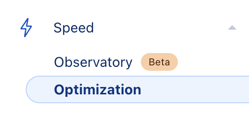
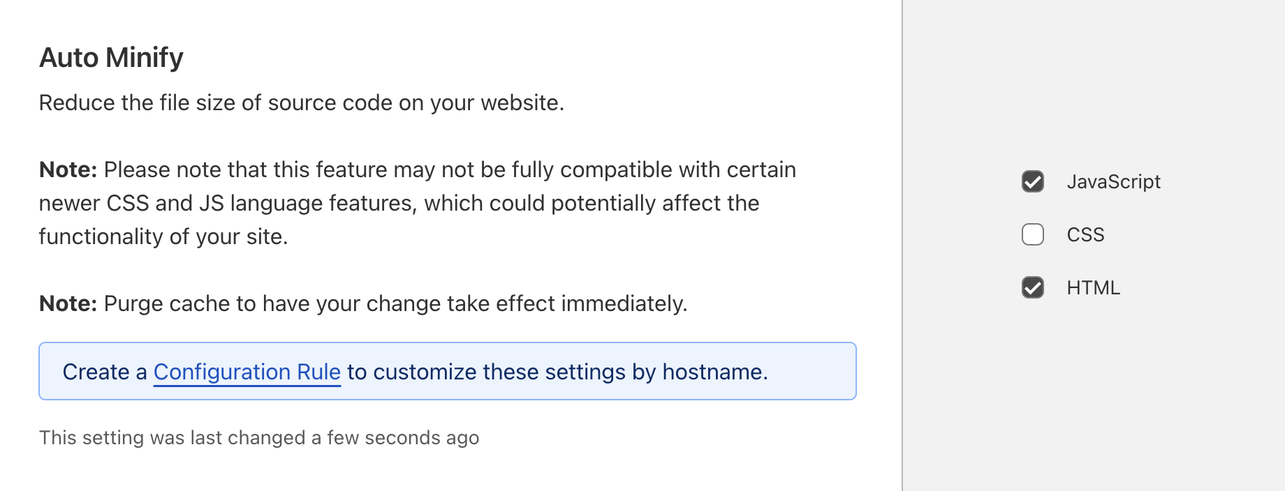
To disable this feature, inside a domain property configuration, go to Speed > Optimization > Content Optimization
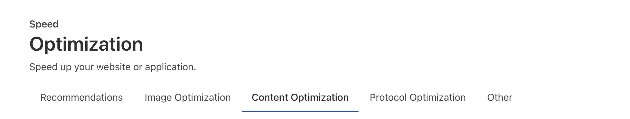
Then scroll down to Auto Minify and make sure CSS is unchecked.
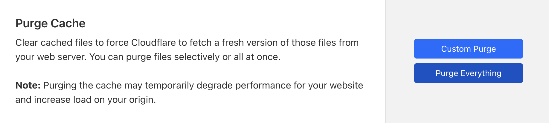
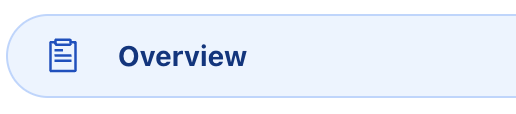
After a few seconds, head over to the main Overview screen for the domain property:
Hit Purge cache and finally Purge Everything.